Putting It All Together Link to heading
For five posts, I’ve been building the case that Python’s developer experience has caught up to R’s — and in some areas surpassed it. Polars for data wrangling. uv for environments. Quarto for documents. Marimo for notebooks. The individual tools are covered. Now it’s time to prove it.
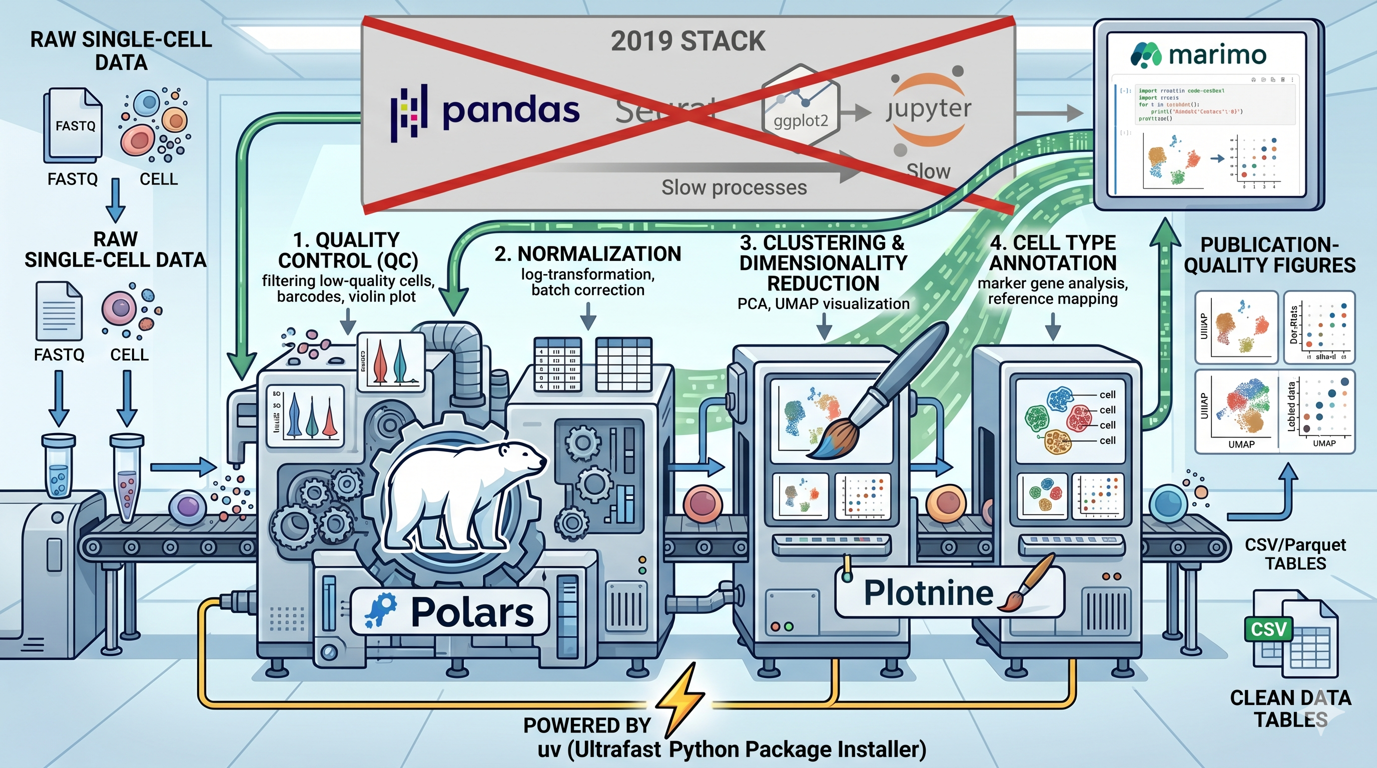
I’ve open-sourced a repository called scanpy-done-right that rebuilds the canonical Scanpy PBMC 3k tutorial from scratch with a deliberately modern stack. Same analysis pipeline — QC, normalisation, highly variable genes, PCA, UMAP, Leiden clustering, marker genes — but with every supporting tool replaced by its 2026 equivalent.
The repo is here: github.com/wolf5996/scanpy-done-right
The Old Way vs. The New Way Link to heading
Here’s the swap table:
| Role | The old way | scanpy-done-right |
|---|---|---|
| Analysis engine | Scanpy | Scanpy (unchanged) |
| Data wrangling | pandas | Polars |
| Visualisation | seaborn / matplotlib | Plotnine |
| Environment | conda / pip | uv |
| Notebook | Jupyter | Marimo |
Scanpy stays. It’s the best single-cell analysis engine in Python and there’s no reason to replace it. Every sc.pp.*, sc.tl.*, and sc.get.* call is a Scanpy call. What changes is everything around it — the wrangling, the plotting, the environment, and the notebook experience.
The New Player: Plotnine Link to heading
This is the tool I’ve been saving for this post, and for R users it might be the most exciting one in the entire series.
Plotnine is a Python implementation of the grammar of graphics — the same paradigm that powers ggplot2 in R. The syntax is nearly identical:
from plotnine import *

(
    ggplot(qc_df, aes(x="n_genes_by_counts"))
    + geom_histogram(bins=50, fill="#2196F3", alpha=0.7)
    + geom_vline(xintercept=200, linetype="dashed", color="red")
    + labs(title="Gene count distribution", x="Genes detected", y="Cells")
    + theme_minimal()
)
If you’ve written ggplot2 code, you can read this immediately. aes(), geom_point(), facet_wrap(), theme_minimal() — it’s all there. Your grammar-of-graphics muscle memory transfers directly.
In this pipeline, Plotnine handles every bespoke visualisation: QC distributions, threshold overlays, HVG dispersion plots, PCA scatter plots, UMAP embeddings, and cluster composition bar plots. Scanpy’s native plots (sc.pl.dotplot, sc.pl.matrixplot) are retained only for cases where they genuinely can’t be beaten — marker gene heatmaps and dot plots that are deeply integrated with the AnnData object.
The result is publication-quality figures with the same aesthetic control you’re used to from ggplot2, running natively in Python.
For R users, this is the missing piece that makes the entire Python migration palatable. The hardest part of leaving R was never the wrangling — it was losing ggplot2. Every time you try to make a decent figure in matplotlib, you remember how elegant ggplot(df, aes(x, y)) + geom_point() was by comparison. Plotnine gives that back. And because it sits on top of matplotlib, you can drop down to the lower level when you need to — but you almost never need to.
The QC step in this pipeline is a great example. Faceted histograms of gene counts, UMI counts, and mitochondrial percentages — with dashed red threshold lines overlaid — take a few lines of Plotnine code and produce figures that look like they belong in a paper, not a tutorial.
How Polars Fits In Link to heading
Every time metadata leaves an AnnData object, it enters Polars territory. adata.obs and adata.var are pandas DataFrames by default (AnnData’s native format), so the workflow converts them at the boundary:
import polars as pl

# Convert metadata to Polars for wrangling
obs_df = pl.from_pandas(adata.obs)

# Clean, chainable operations
qc_summary = (
    obs_df
    .select("n_genes_by_counts", "total_counts", "pct_counts_mt")
    .describe()
)
The marker gene analysis is where Polars really shines. After Scanpy’s rank_genes_groups, the results are extracted into a Polars DataFrame for filtering, sorting, and export — operations that are faster, more readable, and more composable than the pandas equivalent.
Every summary table is exported as a Polars-written CSV, prefixed by pipeline step: 01-qc-metrics-summary.csv, 05-top-markers-per-cluster.csv, 06-cluster-composition.csv. Clean, traceable, reproducible.
The Pipeline Architecture Link to heading
The repository follows a deliberate structure that separates inputs, intermediates, and outputs:
scanpy-done-right/
├── pyproject.toml          # uv project metadata
├── uv.lock                 # Locked dependencies
├── read/                   # Raw inputs (PBMC 3k auto-downloads)
├── checkpoints/            # Intermediate AnnData (.h5ad)
├── write/
│   ├── figures/            # Output plots (step-prefixed PNGs)
│   └── tables/             # Output tables (step-prefixed CSVs)
└── scripts/
    ├── pbmc3k-default-pipeline.py    # Marimo (canonical)
    ├── pbmc3k-default-pipeline.qmd   # Quarto (comparison)
    └── pbmc3k-default-pipeline.ipynb # Jupyter (comparison)
The Marimo notebook is the canonical entry point. The Quarto and Jupyter versions are included as format comparisons — same code, different containers — so you can see the difference firsthand.
Checkpointed AnnData files (adata-qc.h5ad, adata-normalized.h5ad, adata-clustered.h5ad, adata-final.h5ad) let you pick up at any stage without re-running everything. This is a pattern borrowed from well-structured R pipelines — save your intermediate objects, don’t depend on a single monolithic notebook run.
Running It Link to heading
Getting started takes three commands:
git clone https://github.com/wolf5996/scanpy-done-right.git
cd scanpy-done-right
uv sync
That’s it. uv resolves every dependency from the lockfile in seconds. No conda, no channel conflicts, no “solving environment.” Then:
# Interactive (recommended)
uv run marimo edit scripts/pbmc3k-default-pipeline.py

# Headless (runs top-to-bottom)
uv run python scripts/pbmc3k-default-pipeline.py
The Marimo notebook opens in your browser with reactive execution. Change a QC threshold and watch downstream cells update automatically. Explore the data interactively, then export your figures and tables.
What This Proves Link to heading
This repository isn’t just a tutorial — it’s a proof of concept for the entire series thesis.
Every pain point I identified in Post 1 has a concrete solution working together in one pipeline. Polars replaces pandas with faster, more readable wrangling (Post 2). uv replaces conda with deterministic, seconds-fast environment setup (Post 3). Marimo replaces Jupyter with reactive, version-control-friendly notebooks stored as .py files (Post 5). And Plotnine brings the grammar of graphics to Python, giving R users the plotting paradigm they already know.
The analysis itself is standard PBMC 3k — nothing exotic, nothing novel. That’s the point. The value isn’t in the biology; it’s in demonstrating that the developer experience of doing single-cell analysis in Python is now genuinely pleasant.
I want to emphasise something for the R users reading this: two years ago, this stack didn’t exist in a usable form. Polars hadn’t hit 1.0. uv didn’t exist. Marimo was brand new. Plotnine was there, but it was niche. The ecosystem has matured remarkably fast, and the combined result is a Python workflow that an R user can pick up in an afternoon — because every tool in it was either inspired by or directly ported from the R ecosystem’s best ideas.
The three format mirrors — Marimo, Quarto, and Jupyter — are included deliberately so you can compare them side by side. Same code, three containers. Open all three and you’ll see exactly why the foundations posts argued what they did. The .py file diffs cleanly, the .qmd reads like a document, and the .ipynb is… still JSON.
What’s Next Link to heading
This pipeline is deliberately scoped: no differential expression, no enrichment analysis, no advanced trajectory or velocity methods. Those are coming in future posts as we go deeper into the scverse ecosystem — CellTypist for annotation, scVelo for RNA velocity, and more.
For now, clone the repo, run it, and see for yourself what the modern Python single-cell stack feels like. If you’ve been on the fence about adding Python to your toolkit, this is where the rubber meets the road.
See you in the next one.